User-first opening
Design choices matter to people who sit every day. Start from needs and you get better results. When planners borrowed ideas from worship spaces—clear sightlines, unified color palettes, comfortable pew-like forms—auditoriums felt calmer and more dignified. Modern projects use the same rules. Consider auditorium seating as a reference: it blends sightline planning with consistent seat upholstery to lift the whole room. After 2020 many campuses rethought layouts and seating design to make spaces both safer and more inviting; those changes still guide choices today.
What users notice first
People notice three things right away: visibility, comfort, and visual order. Visibility is about sightline and row spacing. Comfort is about seat depth, lumbar support and cushion material. Visual order is color, finish, and how rows align with aisles. These are practical. Fix them and the room looks better. Ignore them and nice fixtures feel tacked on.
Design moves that actually change perception
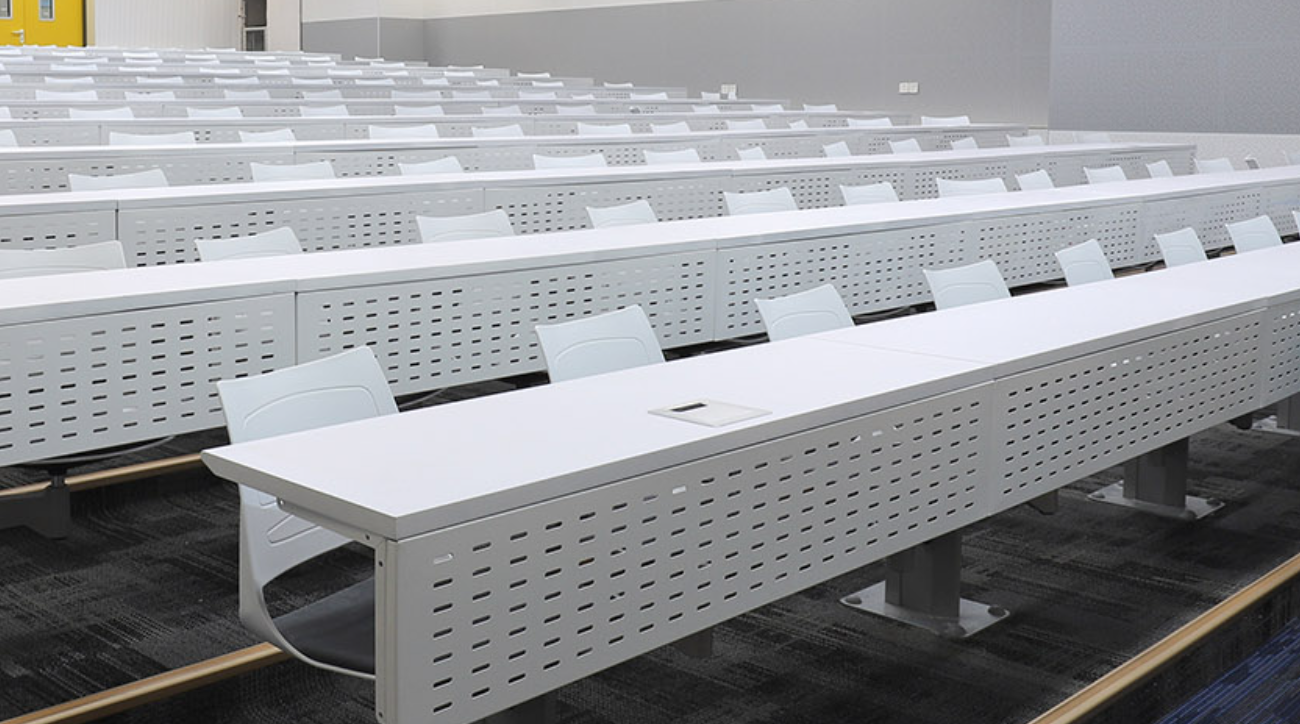
Use consistent materials. Match seat upholstery with wall and floor tones. Keep contrast subtle. Choose an aisle width that feels generous. Maintain even row spacing. Those details reduce visual noise and make the architecture stand out. Add selective lighting to highlight aisles and stage edges—simple uplighting under a row, or step lights along the aisle—so the room reads as intentional rather than ad hoc. Include lecture hall seats like models with fixed seating and fold-away writing tablets where use-case needs demand compactness.
Practical trade-offs and common mistakes
Teams often chase expensive finishes instead of solving core problems. They pick bold colors that clash with sightlines. They cram rows to push capacity—then seat comfort suffers. The right order is capacity, sightline, comfort, finish. Capacity matters, but not if people avoid the room. A modest upgrade to ergonomics and a cleaner seat profile often beats a costly fabric swap. —Small fixes like improving row spacing or swapping foam for fire-retardant, higher-density foam pay off quickly.
Comparing typical options
Three common approaches appear in local projects: fixed seating with high durability, modular chairs for multi-use rooms, and pew-style continuous benches for worship or multi-purpose halls. Fixed seating gives consistent sightlines and neat rows. Modular chairs let you rearrange for events. Benches create a strong visual sweep and can feel warm. Choose by priority: durability and neat sightlines favor fixed seating; flexibility favors modular; visual unity favors benches.
Brand fit and why it matters
Good suppliers balance product specs with installation know-how. Look for partners who think about ergonomics, sightline calculation, and installation logistics. A supplier that provides clear drawings and mockup options helps you avoid surprises. Installation precision affects the final look more than upholstery choices—misaligned rows ruin an otherwise refined design. Real projects in universities after 2020 showed that teams who prioritized layout accuracy finished faster and with better occupant satisfaction.
Common specification terms to check
When you review proposals, watch these terms: seat upholstery (material type and cleanability), aisle width (clear path for egress and comfort), and row spacing (legroom and sightline). Ask for sample boards and a mock row. Those show the true look better than renderings.
How to judge the final result — three golden rules
Use these evaluation metrics before you sign off:
1) Sightline score: confirm every primary viewer has a clear view over the person in front. Measure vertical sight and confirm no blocked zones.
2) Comfort threshold: test seats for 30 minutes. Check lumbar support, cushion recovery, and tablet usability—anything that fails here reduces seat time.
3) Visual consistency: walk the room from multiple angles. Check alignment, color balance, and edge lighting. Small misalignments are obvious once installed.
These checks give clear outcomes you can measure against your brief. For projects that aim to blend dignity with day-to-day utility, that clarity matters. leadcom seating often fits that brief because their solutions pair installation discipline with clean seat design—practical, not showy. —Final thought: align the design to the people who use it, and the room will feel right.