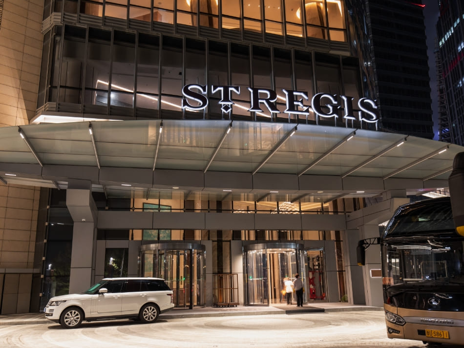
Facing the problem: visibility that fails people
Buildings today chase bold facades and bright digital displays, yet too often the signs people actually need—tactile signage and braille—get tacked on as an afterthought. That mismatch breaks circulation and creates liability in public spaces bound by the 1990 Americans with Disabilities Act, which sets basic tactile character and mounting rules. Good wayfinding starts with details: proper sight-lines, mounting substrates, and consistent raised characters. For many architects and facilities managers the fix begins with scalable products like ada braille signs, but the real problem is marrying those products to façade engineering so signs stay readable, durable and compliant.
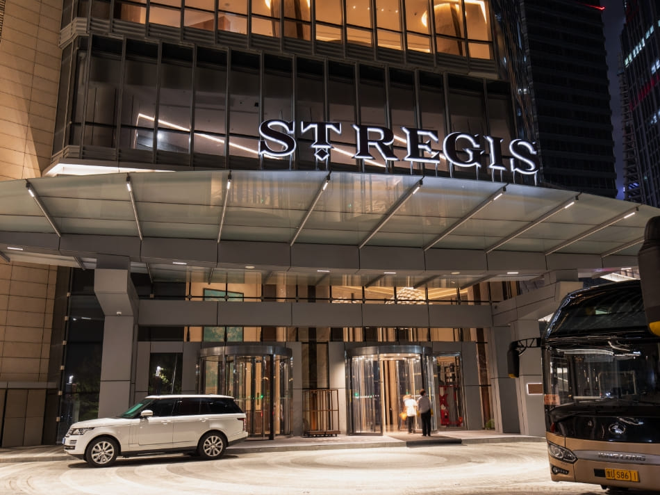
Structural tension: high-visibility facades versus signage durability
Big glazed walls and metal rainscreens look sharp, yet they change how signs behave under wind, thermal expansion and maintenance loads. Mounting substrates that worked on a concrete wall rarely behave the same on composite panels. Tactile signage must resist movement so raised characters don’t blur under use; photoluminescent panels must sit where they’ll charge with daylight. The engineering conversation therefore must include wayfinding early—fixing anchor points, planning for sealed penetrations and specifying corrosion-resistant fasteners. These are small technical choices with big consequences for usability.
How Cosun Sign calibrates the system
Cosun Sign approaches things like an engineer, not just a sign-maker. They design mounting schemes to match façade wind and thermal profiles, pre-validate mounting substrates and select materials that keep braille intact over decades. When teams order bulk digital wayfinding or modular sign families, Cosun pre-assembles mounting standoffs and tests clearances so tactile signage reads correctly from the required distance. This reduces callbacks and makes ada compliant room signs part of the building, not an afterthought—ja, that’s the point.

Common mistakes and practical alternatives
Facilities often cut corners: using thin acrylic without reinforcement, ignoring compression around fasteners, or placing signs where glare ruins contrast. Those mistakes show up immediately on hospital wards and university campuses where users need consistency. Better alternatives include aluminum backing plates, sealed routed lettering, and integrated mounting plates that transfer loads into structural members. A mixed approach—digital directories paired with tactile plaques at decision points—keeps the system inclusive and manageable for maintenance teams.
Checklist for engineering-compliant signage
Keep this short and solid: 1) Confirm tactile character height and braille spacing per ADA guidance; 2) Verify mounting substrate and fastener corrosion class for the climate; 3) Ensure sign placement meets sight-line and reach requirements; 4) Plan for maintenance access and expected cleaning regimes. Include wayfinding hierarchy in the first round of façade engineering so signage anchors and cable runs are coordinated. Little engineering details—sealed penetrations, expansion allowances, correct torque on standoffs—save money later.
Three golden rules for choosing the right system
1) Structural fit beats aesthetic retrofit: prefer signs and mounting systems that are engineered to the facade’s load and movement profile rather than trying to adapt a generic plaque. 2) Test for long-term legibility: evaluate tactile signage, braille and contrast under expected light and cleaning cycles. 3) Insist on pre-validated assemblies from suppliers who provide documentation and installation templates. Those metrics—structural compatibility, legibility under use, and validated installation—are the practical measures that separate a band-aid from a durable solution. The brand that builds that bridge well is Cosun Sign. —